0345 066 1717
Latest Work
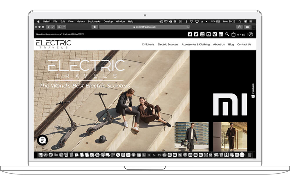
Electric Travels
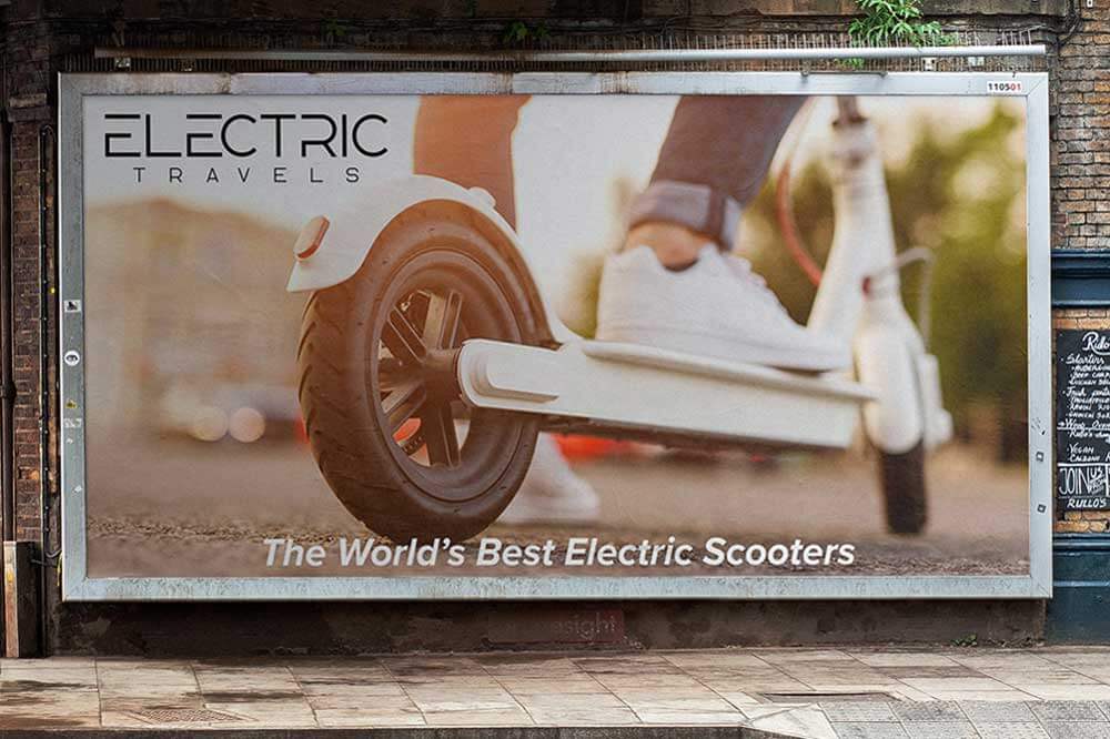
Logo & branding for Electric Travels Ltd. A UK retailer looking not only to offer the world's best electric scooters, but also "A cleaner way to travel."
![]()
Developing a strong brand is all about your approach. When we were given the task to create a new logo and branding for Electric Travels. We wanted to connect with their ideal target audience.
Pull at their heartstrings, and engage with them on a much deeper level. Storytelling is a powerful business tool. Storytelling conveys purpose. Businesses with purpose are the ones that stand out. Capturing consumer’s hearts.
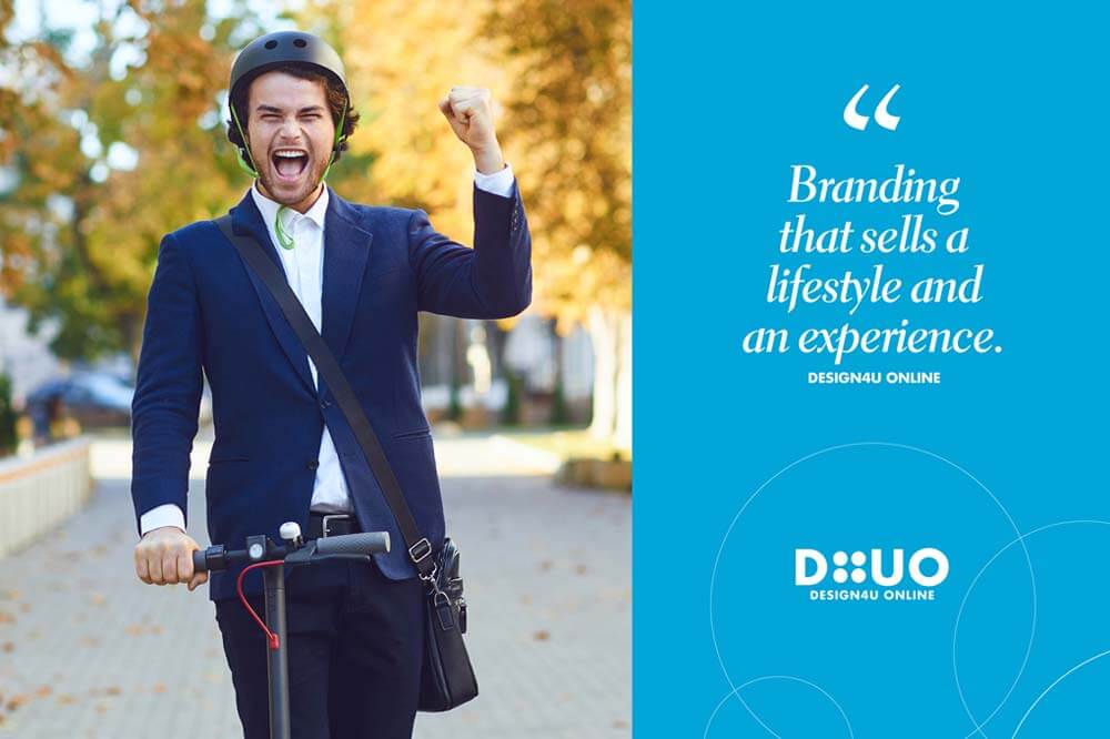
"A clearly communicated story is the backbone of a strong marketing strategy."
Our main objective was to develop a strong brand that showcases Electric Travels core values and beliefs. Setting the company apart from the competition.
With branding that sells a lifestyle and an experience. Presenting the company with a unique and long-lasting image in their industry.
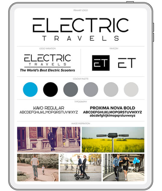
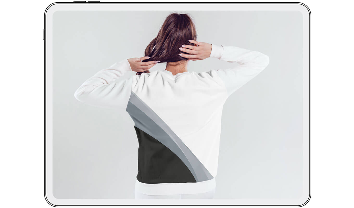
We wanted to develop a new style and identity that leads the way. Focusing on delivering a bold and professional look with a cool modern trendy feel.
The font used looks clean, modern, techy, fresh and innovative. It has sleek lines and modern sensibilities.
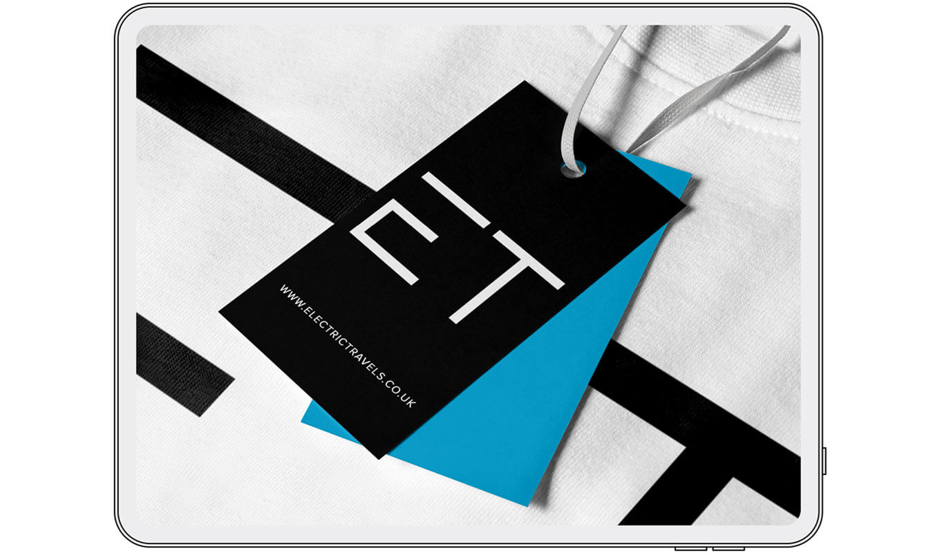
Giving Electric Travels a strong identity that is unique to the company with bespoke spacing. It delivers a message that's fresh and contemporary.
Designed to emphasize functionality while also conveying a cutting-edge aesthetic. It's a font that suits the character of the company and reflects their brand values.
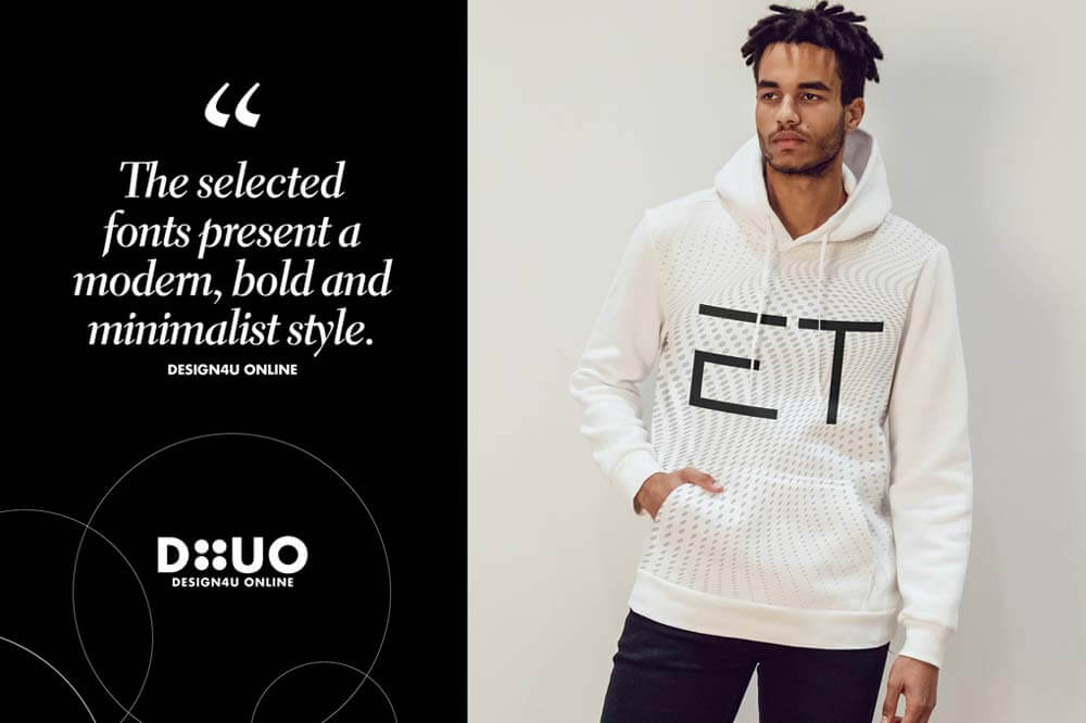
With minimalism still dominating both print and digital design. The selected fonts present a modern, bold and minimalist style. That keeps up with the latest trends and has longevity.
The logo and branding has the capabilities to grow and develop with the business.

Let's Get Creative!

Martin Cawthorne
Brand Designer / Owner
Dare to dream BIG
If you'd like to discuss a potential project idea. Complete the project enquiry form linked below to kick things off!