0345 066 1717
In the world of marketing and consumer products, there’s a noticeable shift toward minimalist design, particularly in packaging. Gone are the days when packaging was crammed with bold fonts, flashy colours, and overwhelming imagery. Today, many brands are choosing simplicity, and minimalist packaging designs are leading the way. This ‘less is more’ approach has proven to be highly effective in capturing consumer attention, delivering brand identity messages clearly, and, most importantly, standing out on crowded shelves. Minimalist packaging also appeals to consumers seeking sustainability, as it often involves less waste and eco-friendly materials. In this post, Design4U Online packaging design agency in the United Kingdom discuss why minimalism is proving to be a key feature in packaging design.

Why Minimalist Design is Taking Over the Packaging Industry
Minimalism isn't just a trend, it’s a reflection of broader shifts in consumer behaviour and cultural aesthetics. As consumers become more discerning and sophisticated, they tend to gravitate toward clean, simple, and elegant designs that convey trust, authenticity, and quality. The minimalist approach speaks directly to these values, presenting products in a way that feels uncluttered and intentional.
In an age of information overload, where people are constantly bombarded with visual stimuli, minimalist packaging offers a refreshing break. It communicates that a brand identity is confident enough in its product to let it speak for itself, without relying on excessive visual or textual cues. Brands that embrace minimalist design convey a sense of refinement and maturity, allowing their products to feel premium, even if they aren’t.
Key Elements of Minimalist Packaging
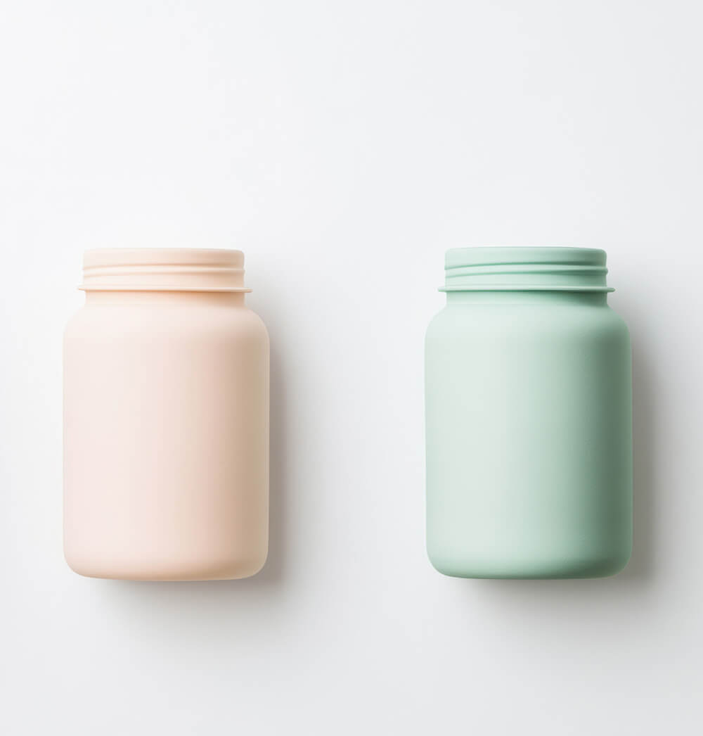
There are several key design elements that contribute to successful minimalist packaging for brand stories, the first being clean lines. Minimalist packaging often features clean, sharp lines that help create a sleek and sophisticated appearance. These lines can draw attention to the shape of the packaging itself or guide the eye toward important information on the product. Clean lines make packaging look tidy and professional, which can enhance the perceived value of the product inside.
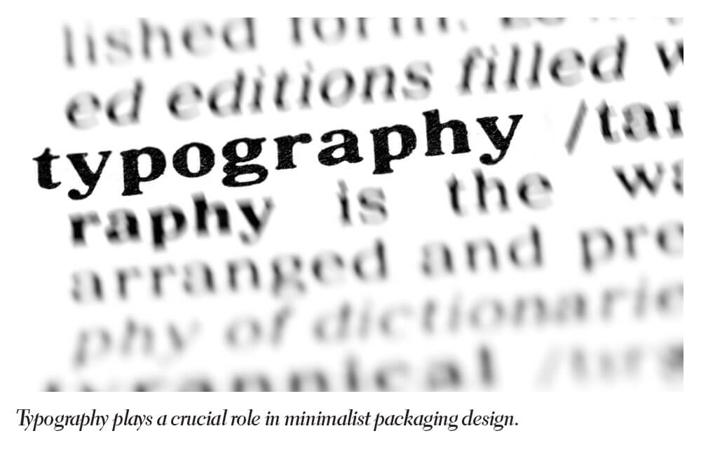
Typography plays a crucial role in minimalist packaging design for consumer goods. Rather than using ornate or decorative fonts, minimalist packaging tends to feature simple, sans-serif fonts that are easy to read and visually appealing. Simple fonts are effective because they strip away unnecessary flourishes, leaving only the essential information, which helps consumers quickly understand the product’s purpose.
Also, one of the most defining characteristics of minimalist packaging design is its limited use of colour. Brand identity embracing minimalism often stick to a monochromatic or neutral colour palette, with occasional splashes of a single accent colour. This restrained use of colour creates a cohesive and sophisticated look, helping to draw attention to the product’s key features or logo without overwhelming the consumer with too much visual information.
You must also consider whitespace; or negative space. Whitespace is an essential element of minimalist design. Instead of filling every inch of the packaging with information or graphics, minimalist packaging uses whitespace to allow the design to ‘breathe’. This creates a feeling of openness and calm, making the packaging appear less busy and more refined. Whitespace also helps direct the viewer's attention to the most important elements of the design, such as the brand strategy name or product type.
Could your business benefit from the ‘less is more’ approach when it comes to your branding and packaging design? If you answered yes or maybe you want to discuss this with our team, we encourage you to visit the Design4U Online packaging design agency website or get in touch with our experts directly by calling us on 0345 066 1717, by emailing us at info@design4uonline.uk or by completing our project enquiry form and we’ll be happy to discuss your brand’s potential for introducing a minimalist packaging design going forward.