0345 066 1717
Brand identity is the visual and emotional connection your business makes with its audience. Among the many elements that contribute to a strong brand identity, colour and typography stand out as two of the most influential. These design choices can shape perceptions, evoke emotions, and make your business memorable in the minds of your customers.
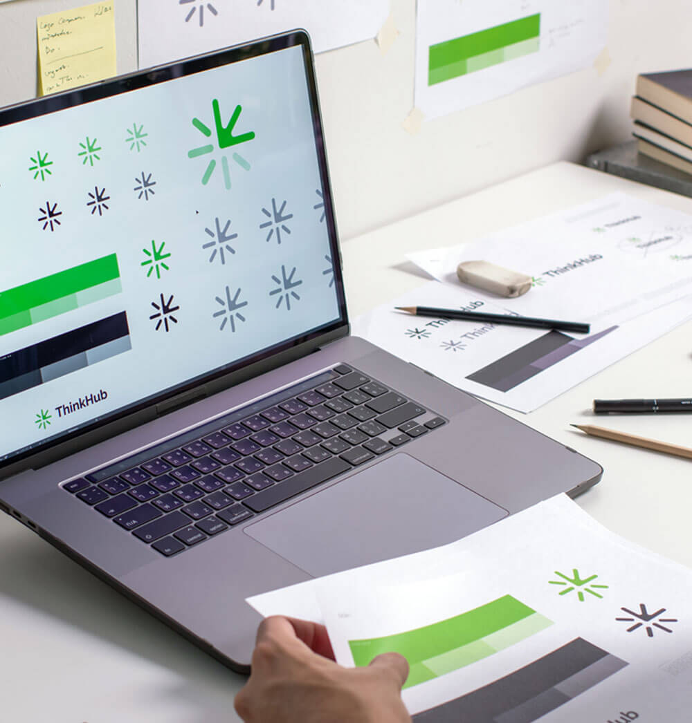
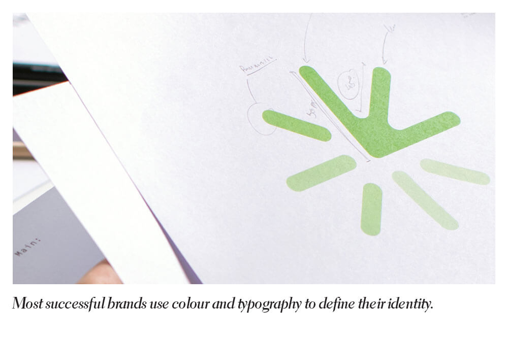
A well-crafted brand identity relies on a deep understanding of how colours and typography work together to create a cohesive and compelling visual presence. For businesses working with a professional brand design studio, these elements form the foundation of a successful branding strategy.
The Power of Colour in Brand Identity
Colour is one of the first things people notice about a brand, and it can leave a lasting impression. Studies show that up to 90% of snap judgements about products are based on colour alone, making it a vital consideration in brand design.
Colours have the unique ability to convey emotions and meanings, often without the need for words. For instance, red is associated with energy and passion, while blue is often linked to trust and professionalism. When choosing a colour palette for your brand, it’s important to think about the emotions and values you want to communicate.
Beyond emotion, colour also plays a practical role in brand recognition. A consistent colour palette makes your brand more recognisable, even at a glance. Take global brands like Coca-Cola or Facebook, for example. Their signature colours are so ingrained in their identity that they’re instantly recognisable.
For businesses, working with a brand design studio ensures that colour choices are not just aesthetically pleasing but also aligned with the company’s mission and target audience. A professional designer will often use tools like colour theory and market research to choose a palette that resonates with the right audience while setting the business apart from competitors.
The Psychology of Colour and Typography
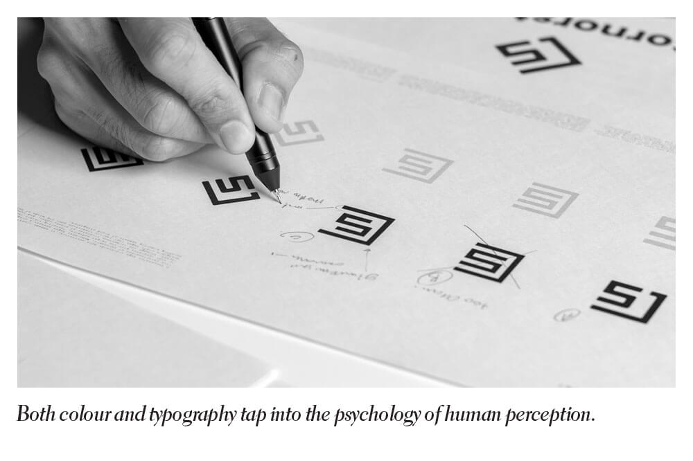
Both colour and typography tap into the psychology of human perception. Understanding how people respond to these visual cues is crucial for creating a brand identity that resonates.
Colours, for example, can trigger subconscious responses. Green often suggests growth and sustainability, while yellow conveys optimism and creativity. Typography has a similar psychological effect. Fonts with sharp edges may feel aggressive, while rounded fonts appear friendly and approachable.
Using this psychological insight, a brand design studio can craft a visual identity that aligns with your business values and appeals to your target audience. It’s not just about making things look nice; it’s about creating a strategic connection that influences how people feel about your brand.
At Design4U Online, we understand the art and science behind effective brand design. With a wealth of experience and a keen eye for detail, we specialise in helping businesses create visual identities that are not only beautiful but also meaningful. Whether you’re starting from scratch or looking to refresh your branding, our expert designers will work closely with you to bring your vision to life. Explore our services today and discover how the right combination of colour and typography can transform your brand identity.